🧾 IELTS Writing Task 1: Pie Chart – Step-by-Step Structure
1. Introduction (Paraphrase the question)
- Start by rewriting the task question using your own words.
- Mention what the pie chart shows (e.g., proportions, categories, year, location).
- Do not include any numbers or data here.
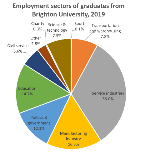
🖋 Example: The provided pie chart illustrates the distribution of employment sectors among graduates from Brighton University in a specific year.
2. Overview (Summary of main trends)
- Give a general picture without specific details.
- Highlight the largest and smallest segments.
- Mention overall patterns or any striking contrasts.
🖋 Example: Overall, it is clear that the majority of graduates entered service-related fields, while only a few chose sectors like sports and charity.
3. Body Paragraph 1 (First set of data)
- Start presenting specific figures from the chart.
- Group related categories together (e.g., top 3 sectors).
- Use comparison phrases (e.g., more than, followed by, whereas).
🖋 Example: The service industry accounted for the highest proportion, followed by manufacturing and education sectors.
4. Body Paragraph 2 (Remaining data)
- Present the rest of the categories, especially smaller segments.
- Mention any unexpected or interesting patterns.
- End with a sentence that wraps up your observations.
🖋 Example: Conversely, sectors like sport and charity attracted the least number of graduates, making up only a tiny fraction of the total.
Here is a list of IELTS Pie Chart questions and model answers:
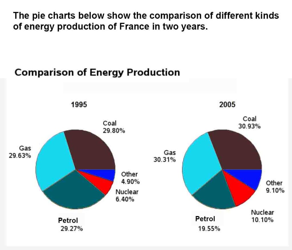
1. The pie charts below show the comparison of different kinds of energy production of France in two years.
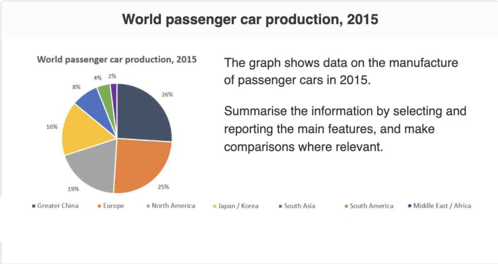
2. IELTS Pie chart: Word passenger car production
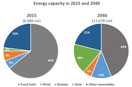
3. IELTS Pie chart. Energy capacity
The pie charts below compare the proportion of energy capacity in gigawatts (GW) in 2015 with the predictions for 2040.Summarise the information by selecting and reporting the main features, and make comparisons where relevant.
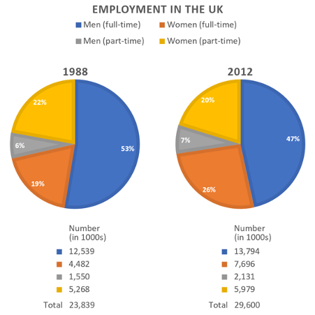
4. Employment in the UK
The charts give information about employment in the UK in 1998 and 2012. Summarise the information by selecting and reporting the main features, and make comparisons where relevant.
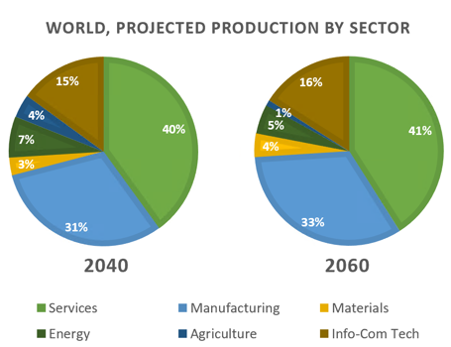
5. Global production by sector in 2040
The charts show projections for global production by sector in 2040 and 2060. Summarise the information by selecting and reporting the main features, and make comparisons where relevant.
6. Employment sectors of graduates
The chart below shows the proportions of graduates from Brighton University in 2019 entering different employment sectors. Summarise the information by selecting and reporting the main features, and make comparisons where relevant.
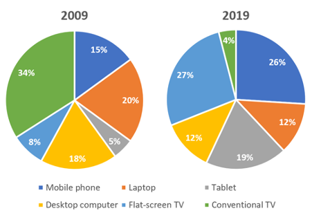
7. People watching TV in Canada.
The pie charts below show the devices people in the 18 to 25 age group use to watch television in Canada in two different years. Summarise the information by selecting and reporting the main features, and make comparisons where relevant.
IELTS Academic Writing Task 1 Types
Explore and prepare for different chart types used in IELTS Task 1
IELTS Bar Charts
Understand how to interpret and describe bar charts in task 1.

IELTS Pie Charts
Learn the techniques for describing pie charts in detail.
IELTS Line Graph
Get tips on how to describe trends using line graphs.
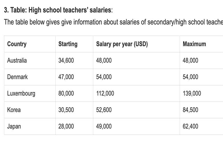
IELTS Table
Master the skills to describe tables in academic writing.
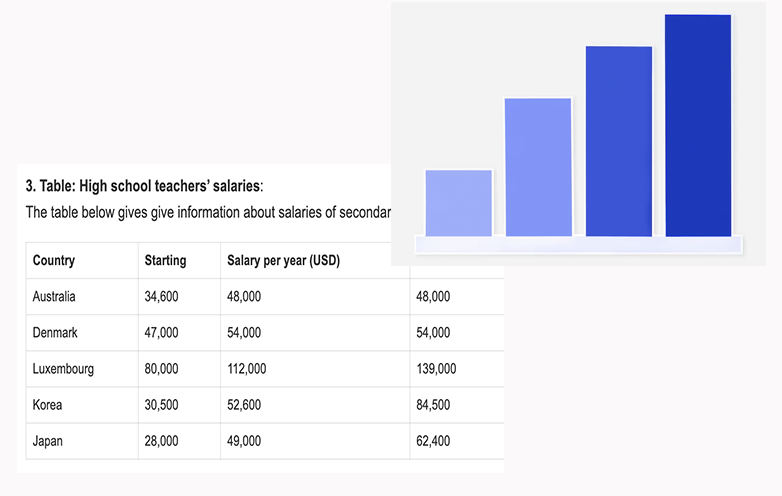
IELTS Bar Chart + Table
Learn how to combine bar charts with tables in task 1 responses.
IELTS Maps
Explore how to describe maps and geographical changes.
IELTS Process Diagram
Understand how to write about process diagrams step by step.
IELTS Bar Chart + Line Graph
Learn how to integrate bar charts with line graphs.
IELTS Bar Chart + Pie Chart
Master combining bar charts with pie charts in task 1.
Do you need printed IELTS/ OET practice material? Place your order today. Available now for just Rs: 1,100 (including shipping all across India) Contact us at our WhatsApp number: +91 9886926773 to place your order. (Free for LTC students)
We hope this information has been valuable to you. If so, please consider a monetary donation to Lifestyle Training Centre via UPI. Your support is greatly appreciated.

Would you like to undergo training for OET, PTE, IELTS, Duolingo, Phonetics, or Spoken English with us? Kindly contact us now!
📱 Call/WhatsApp/Text: +91 9886926773
📧 Email: mail@goltc.in
Visit us in person by following the directions on Google Maps. We look forward to welcoming you to the Lifestyle Training Centre.
Follow Lifestyle Training Centre on social media:
Thank you very much!