The charts give information about employment in the UK in 1998 and 2012. Summarise the information by selecting and reporting the main features, and make comparisons where relevant.
Model answer by Lifestyle Training Centre
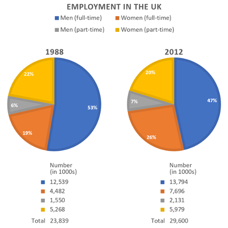
The given pie charts illustrate the number of men and women who were employed in various part-time and full-time roles in the United Kingdom in the years 1988 and 2012. The figures are expressed in thousands.
Overall, there was a marked disparity between the proportions of men engaged in part-time versus full-time employment, with the latter overwhelmingly dominating. Interestingly, the distribution of women across part-time and full-time roles was comparatively balanced in both years.
In 1988, 53% of men were in full-time employment, accounting for 12,539,000 individuals, whereas only 6% (1,550,000) were engaged in part-time roles. By 2012, this percentage had declined slightly to 47%, although the number rose to 13,794,000. Conversely, the proportion of men in part-time work marginally increased from 6% (1,550,000) in 1988 to 7% in 2012, totalling 2,131,000.
In 1988, 22% of women were employed part time, totalling 5,268,000, which decreased by 2% in 2012, although the actual number rose to 5,979,000. Meanwhile, only 19% of women (4,482,000) held full-time positions in 1988; however, by 2012, this figure had increased significantly to 26%, representing 7,696,000 individuals. The overall number of jobs held by both genders grew from 23,839,000 in 1988 to 29,600,000 in 2012.
📚 Band 9 Vocabulary with Meanings
| Word / Phrase | Meaning |
|---|---|
| illustrate | To clearly show or explain something, often with data or visuals |
| employed | Having a job or being in paid work |
| part-time / full-time roles | Jobs requiring fewer hours (part-time) or standard working hours (full-time) |
| figures are expressed in thousands | The data is presented in units of one thousand |
| Overall | Used to introduce a general summary or main trend |
| marked disparity | A clear and significant difference |
| proportions | The parts or shares of a whole expressed as percentages |
| engaged in | Actively involved in or working in |
| overwhelmingly dominating | Being clearly more prevalent or in control |
| comparatively balanced | Fairly equal or evenly distributed |
| accounting for | Representing or forming part of a total |
| whereas | In contrast; used to show difference between two things |
| declined slightly | Reduced by a small margin |
| rose to | Increased to a certain level or number |
| conversely | In an opposite manner or direction |
| marginally | By a very small amount |
| totalling | Adding up to a particular number |
| prevalent | Common or widespread |
| held full-time positions | Were employed in full-time jobs |
| had increased significantly | Had gone up by a large and noticeable amount |
| representing | Standing for or symbolising a quantity or concept |
| overall number of jobs | The total sum of employment positions |
| grew from… to… | Increased in quantity over a period |
| driven largely by | Caused mainly or primarily by |
| greater female participation | Higher involvement of women |
| employment landscape | The structure or pattern of employment across a society or economy |
🧠 Bonus Tip:
To master IELTS vocabulary, don’t just memorise — use these phrases in writing/speaking tasks.
🎓 IELTS Writing Task 1 – Lecture & Explanation (Pie Charts – Employment by Gender and Job Type)
📌 Task Summary
You are given two pie charts that show the distribution of male and female workers in part-time and full-time jobs in the United Kingdom in the years 1988 and 2012. The numbers are in thousands, but the charts also provide percentages.
🧠 Lesson Objective
By the end of this session, students will:
- Understand how to structure a high-scoring IELTS Task 1 response
- Learn key academic vocabulary and expressions
- Recognise what makes a Band 9 answer logical, accurate, and formal
🧱 STRUCTURE OF A BAND 9 RESPONSE
Your Band 9 response is built on four strong paragraphs:
🟦 1. Introduction
The given pie charts illustrate the number of men and women employed in various part-time and full-time roles in the United Kingdom in the years 1988 and 2012. The figures are expressed in thousands.
Explanation:
- Clearly paraphrases the question.
- Mentions what kind of data is shown (employment).
- States the units (in thousands).
- Avoids copying phrases like “showcase” or “number of people” — instead, it uses formal academic verbs like illustrate and employed.
🟩 2. Overview (Most Important Paragraph)
Overall, there was a marked disparity between the proportions of men engaged in part-time versus full-time employment, with the latter overwhelmingly dominating. Interestingly, the distribution of women across part-time and full-time roles was comparatively balanced in both years.
Explanation:
- This is the most critical part of the essay for Band 7 and above.
- Gives the main trend without too many numbers.
- Uses strong academic phrases like marked disparity, overwhelmingly dominating, and comparatively balanced.
- Highlights gender trends — men mainly in full-time jobs, women split more evenly.
📝 Tip: Never include numbers in the overview — just give the big picture.
🟨 3. Body Paragraph 1 – Trends for Men
In 1988, 53% of men were in full-time employment, accounting for 12,539,000 individuals, whereas only 6% (1,550,000) were engaged in part-time roles. By 2012, this percentage had declined slightly to 47%, although the number rose to 13,794,000. Conversely, the proportion of men in part-time work increased marginally to 7%, totalling 2,131,000.
Explanation:
- Focuses only on male employment.
- Gives both percentages and exact numbers clearly and accurately.
- Shows changes over time using strong linking phrases:
- whereas, by 2012, conversely, totalling
- Balances comparisons (e.g., contrast between part-time and full-time, 1988 and 2012).
🟥 4. Body Paragraph 2 – Trends for Women
In 1988, 22% of women were employed part time, totalling 5,268,000, which decreased by 2% in 2012, although the actual number rose to 5,979,000. Meanwhile, only 19% of women (4,482,000) held full-time positions in 1988; however, by 2012, this figure had increased significantly to 26%, representing 7,696,000 individuals. The overall number of jobs held by both genders grew from 23,839,000 in 1988 to 29,600,000 in 2012.
Explanation:
- Focuses on female employment trends.
- Very strong grammar and transitions:
- which decreased, although the actual number rose, meanwhile, however
- Highlights a key insight: In 2012, more women worked full-time than part-time, unlike in 1988.
- Ends with a good summarising fact — total jobs increased.
💡 Teaching Points for Learners
✅ What Makes This Band 9?
| Feature | Why It Matters |
|---|---|
| Accurate reporting | No factual errors in numbers or percentages |
| Sophisticated vocabulary | Words like illustrate, disparity, totalling, engaged in |
| Wide grammatical range | Variety of tenses, clauses, passives, and comparative structures |
| Formal tone | No casual words like a lot of, many people, big rise |
| Logical paragraphing | Each paragraph focuses on a clear theme (intro, overview, men, women) |
🗣️ Bonus Speaking Exercise (Optional)
Ask yourself and try answering:
“What changes do you notice about female employment from 1988 to 2012?”
This helps you convert writing insights into speaking fluency.
📌 Final Reminders for Students
- Select key comparisons.
- Always group data logically (e.g., by gender or by job type).
- Use clear overview statements to summarise main trends.
- Be objective – avoid opinions or guesses like “this may be because…”.
IELTS Academic Writing Task 1 Types
Explore and prepare for different chart types used in IELTS Task 1
IELTS Bar Charts
Understand how to interpret and describe bar charts in task 1.

IELTS Pie Charts
Learn the techniques for describing pie charts in detail.

IELTS Line Graph
Get tips on how to describe trends using line graphs.
IELTS Table
Master the skills to describe tables in academic writing.
IELTS Bar Chart + Table
Learn how to combine bar charts with tables in task 1 responses.
IELTS Maps
Explore how to describe maps and geographical changes.
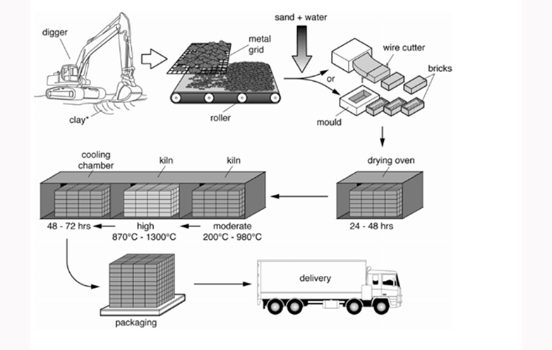
IELTS Process Diagram
Understand how to write about process diagrams step by step.

IELTS Bar Chart + Line Graph
Learn how to integrate bar charts with line graphs.

IELTS Bar Chart + Pie Chart
Master combining bar charts with pie charts in task 1.
Free admission and English Courses. കാശ് കൊടുക്കാതെ അഡ്മിഷൻ. FREE ഇഗ്ലീഷ് കോഴ്സുകൾ. ഈ ഓഫർ നേടൂ. Contact us at +91 9886926773 പ്രോസസ്സിംഗ് ആയാസകരം.

Speak English with Pride – Not Hesitation! Join Our Intensive Batch – Fluency, Accent & Confidence in 1 Month. Starts Feb 17 | Call/WhatsApp: +91 9886926773 Now. #fluency #accent #English

Ready to study abroad or master OET, PTE, IELTS, Duolingo, Phonetics, or Spoken English?
📞 Call us now at +91 9886926773
📱 Call/WhatsApp/Text: +91 9886926773
📧 Email: mail@goltc.in
Visit us in person by following the directions on Google Maps. We look forward to welcoming you to the Lifestyle Training Centre.
Follow Lifestyle Training Centre on social media:
Thank you very much!