The pie charts below compare the proportion of energy capacity in gigawatts (GW) in 2015 with the predictions for 2040.Summarise the information by selecting and reporting the main features, and make comparisons where relevant.
Model answer by Lifestyle Training Centre
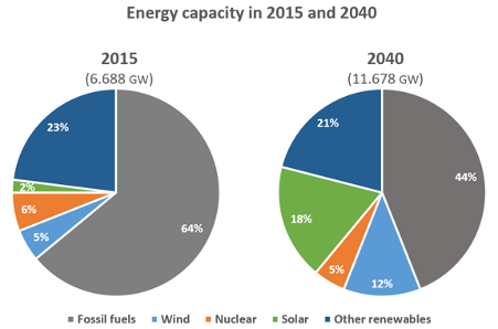
The provided two pie charts compare the percentage of energy produced in 2015 with the projected figures for 2040, across various sources including fossil fuels, wind, nuclear, solar, and other renewables. The energy capacity is delineated in gigawatts (GW).
Overall, it is evident that fossil fuels and other renewables remain the major energy contributors throughout the given period. Moreover, solar and wind energy are predicted to increase substantially in the future.
The aggregate capacity in 2015 was 6.688 GW, which is expected to almost double to 11.678 GW by 2040. Fossil fuels covered 64% of the energy capacity, which will undergo a considerable downturn to a mere 44% by the year 2040. Other renewables and nuclear, however, are expected to only experience a marginal decline in energy production: the former from 23% in 2015 to 21% by 2040, and the latter from 6% in 2015 to 5% in 2040.
Conversely, both solar and wind energy are estimated to soar remarkably – solar from 2% in 2015 to a staggering 18% by 2040, and wind energy from 5% in 2015 to 12% by 2040.
The table below shows the proportion of income spent on 4 common items in the UK in 1998.
The proportion of income adults and children spent on 4 common items in the UK in 1998
food
electronic equipment
music
videos
adults
25%
5%
5%
1%
men
14%
10%
5%
2%
women
39%
1%
5%
0.5%
children
10%
23%
39%
12%
boys
9%
18%
38%
18%
girls
11%
5%
40%
17%
Model answer by Lifestyle Training Centre
The provided table delineates the expenditure patterns of adults and children in the United Kingdom across four distinct categories (food, electronic equipment, music, and videos) during the year 1998, presented as percentages of their total earnings.
In summary, adults allocated a significant portion of their expenditures to food, contrasting with the minimal spending on videos. Children, on the other hand, showed a distinct pattern, emphasizing music spending over food.
Among adults, 25% of expenditures went to food, with men at 14% and women at 39%. Conversely, video spending was minimal, combining at 1%—0.5% for women and 2% for men. Music expenses, 5%, were evenly split at 5% between both genders. Electronic equipment constituted 5%, with women at 1% and men at 10%.
Among children, 39% of income went to music—boys 38%, girls 40%. Conversely, food received the smallest share at 10% (boys 9%, girls 11%). Electronic equipment constituted 23% of expenditures, with boys at 18% and girls at 5%. Videos were accounted for 12%, split with boys at 18% and girls at 17%.
List of vocabulary used:
Delineates: Describes or portrays something precisely; outlines.
Expenditure: The action of spending funds or the amount spent.
Patterns: Regular and repeated arrangements or trends in behavior or data.
Distinct: Recognizably different or unique.
Allocated: Distributed or assigned for a specific purpose.
Contrasting: Showing differences when compared; differing significantly.
Minimal: The least amount or degree; very small.
Emphasizing: Giving special importance or prominence to something.
Constituted: Made up or formed; composed.
Income: Money received, especially on a regular basis, for work or through investments.
Share: The portion of something that is divided among a group.
Accounted for: Considered or included in a total.
Split: Divided into parts or sections.
Genders: The categories of male and female, often used in the context of social or cultural roles.
Percentage: A proportion expressed as a fraction of 100.
Significant: Sufficiently great or important to be worthy of attention.
Totaling: Adding up to a specific amount or sum.
Expenses: The costs incurred in the process of producing or consuming goods and services.
Allocated: Assigned or distributed to a particular purpose.
Income distribution: The way in which total income is divided among individuals or groups.
IELTS Speaking Task Topics | Lifestyle Training Centre
Do you need printed IELTS/ OET practice material? Place your order today. Available now for just Rs: 1,100 (including shipping all across India) Contact us at our WhatsApp number: +91 9886926773 to place your order. (Free for LTC students)
We hope this information has been valuable to you. If so, please consider a monetary donation to Lifestyle Training Centre via UPI. Your support is greatly appreciated.
Would you like to undergo training for OET, PTE, IELTS, Duolingo, Phonetics, or Spoken English with us? Kindly contact us now!
We hope this information has been valuable to you. If so, please consider a monetary donation to Lifestyle Training Centre via UPI. Your support is greatly appreciated.
Would you like to undergo training for OET, PTE, IELTS, Duolingo, Phonetics, or Spoken English with us? Kindly contact us now!
The given diagram meticulously illustrates the various steps that are involved in the conversion of rainwater into potable water in one of the Australian towns.
In general, the procedure encompasses the gathering of rainwater from rooftops, directing it for filtration, storing it underground, conducting treatment, and ultimately distributing it to households for drinking purpose.
Initially, rainwater is harvested from the rooftops of individual households with the help of attached gutters. It is then directed through interconnected drains to a water filtration system in order to remove any contaminants. Once the rain water is filtered, the same is sent to a designated underground storage facility.
The concluding phase involves transferring the stored water to another storage facility for the purpose of chemical treatment. After undergoing the necessary chemical treatment, the water is ready to be consumed. It is then distributed to each household for the purpose of consumption through pipes and fittings.
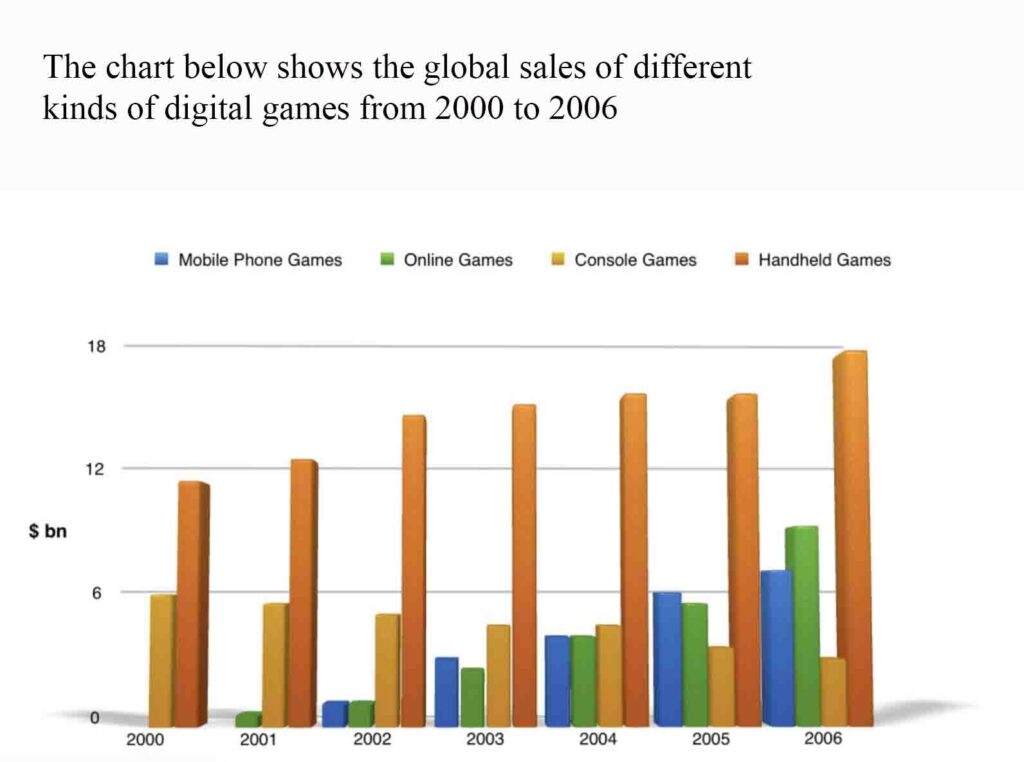
The presented bar chart meticulously outlines the global sales trajectories for four distinct categories of digital entertainment: Mobile phone games, online games, console games, and handheld games—spanning from 2000 to 2006. The monetary values are denominated in billion dollars.
Overall, it is patently evident that sales for handheld games, mobile phone games, and online games experienced a pronounced ascension throughout the seven-year period. In stark contrast, console games consistently declined in sales over consecutive years. Notably, handheld games unequivocally dominated the digital gaming market among the four categories.
Zooming in, the sales of Handheld games peaked just below $12 billion in 2000, incrementally ascending to approximately $18 billion by 2006. Online games, introduced in 2001 with initial sales below $0.5 billion, underwent a meteoric upturn, reaching around $9 billion by 2006. Similarly, Mobile phone games, emerging in 2002 with around $1 billion in sales, demonstrated marked escalation, achieving approximately $7 billion in sales by 2006.
In contradistinction, Console games, despite an initial sale of around $6 billion in 2000, exhibited a discernible decrement year on year. Although sales stabilised around $5 billion in 2003 and 2004, they subsequently plummeted to around $3 billion by 2006—almost half of the initial sale.
We hope this information has been valuable to you. If so, please consider a monetary donation to Lifestyle Training Centre via UPI. Your support is greatly appreciated.
Would you like to undergo training for OET, PTE, IELTS, Duolingo, Phonetics, or Spoken English with us? Kindly contact us now!
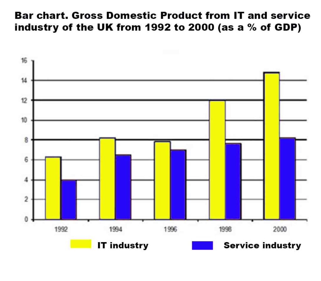
The provided bar chart delineates the Gross Domestic Product (GDP) of the United Kingdom, attributed to the Information Technology (IT) and service industry. The data spans a nine-year period, covering the years 1992 to 2000.
Overall, it is evident that the percentage of GDP witnessed a substantial increase, nearly doubling over the nine-year period for both the Information Technology and Service industries, despite minor fluctuations.
Commencing at slightly above 6% in the year 1992, the IT industry witnessed an upward trajectory, peaking at over 8% in the year 1994. Despite a marginal decline in the year 1996 to just under 8%, the GDP soared, reaching a pinnacle of approximately 15% by the year 2000.
Concurrently, the Service Industry’s GDP, starting at 4 percentage in the year 1992, exhibited a consistent upward trend, culminating in a figure slightly surpassing 8 percentage by the conclusion of the period in the year 2000.
List of vocabulary used:
1. Provided – supplied, given 2. Delineates – describes, outlines 3. Gross Domestic Product (GDP) – national income, economic output 4. Attributed – related, linked 5. Information Technology (IT) – computing, tech industry 6. Service industry – service sector, tertiary sector 7. Data – information, statistics 8. Spans – covers, extends over 9. Period – timeframe, duration 10. Overall – generally, in summary
21. Peaking – reaching the highest point, hitting a maximum 22. Marginal – slight, minor 23. Decline – decrease, drop 24. Soared – skyrocketed, surged 25. Pinnacle – peak, summit 26. Approximately – about, nearly 27. Concurrently – at the same time, simultaneously
We hope this information has been valuable to you. If so, please consider a monetary donation to Lifestyle Training Centre via UPI. Your support is greatly appreciated.
Would you like to undergo training for OET, PTE, IELTS, Duolingo, Phonetics, or Spoken English with us? Kindly contact us now!