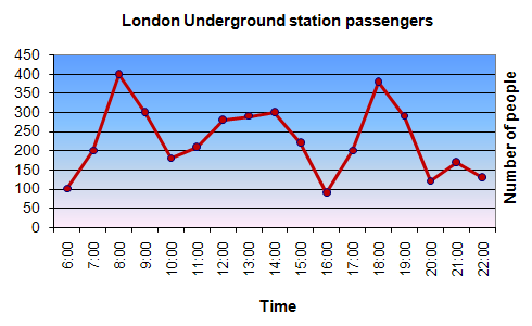
The graph shows Underground Station Passenger Numbers in London. Summarise the information by selecting and reporting the main features, and make comparisons where relevant.

Model answer by Lifestyle Training Centre
The given line graph delineates the strength of underground station passengers in London from morning to night.
Overall, it is evident that there are notable and almost identical surges in the headcounts of those who use this underground facility in the evening and in the early morning while late night and late afternoon records the lowest number of commuters.
Zooming in, from early morning 6.00 am to 8.00am, there is a significant upturn in the number of people, starting from 100 and culminating at 400. From this point, by 10.00am, the numbers plummet drastically to around 170. Though the headcounts rise from then on and climbs to 300 by 2.00pm in the afternoon, it plunges to under 100 by 4.00pm.
From 4.00pm, resembling the morning trend, the rush starts again, and the number of people spikes impressively from under 100 to around 390 in two hours. However, this upsurge comes to a halt by 6.00pm and the numbers fade away, descending substantially to around just 130 by 8.00pm. Though it recovers to around 170 by 9.00pm, it ultimately drops to under 150 by 10.00pm.
(word count: 183)
