In IELTS Writing Task 1, a line graph is a type of visual representation that displays data points connected by lines, illustrating trends or changes over a specific period of time. Line graphs are commonly used to show fluctuations, trends, or patterns in numerical data, such as changes in temperature over months, sales figures over years, or population growth over decades. When describing a line graph in IELTS, candidates are required to analyze and report the main trends, significant fluctuations, and any notable patterns or relationships depicted by the graph. It’s essential to identify key features, such as peaks, troughs, and overall trends, and provide accurate comparisons and observations. Additionally, candidates should use clear and precise language, employ appropriate vocabulary related to trends and changes, and organize their response in a logical and coherent manner. Effective interpretation and description of the data presented in a line graph are essential skills evaluated in IELTS Writing Task 1.
Below is a list of IELTS writing task 1, line graph questions and sample answers:
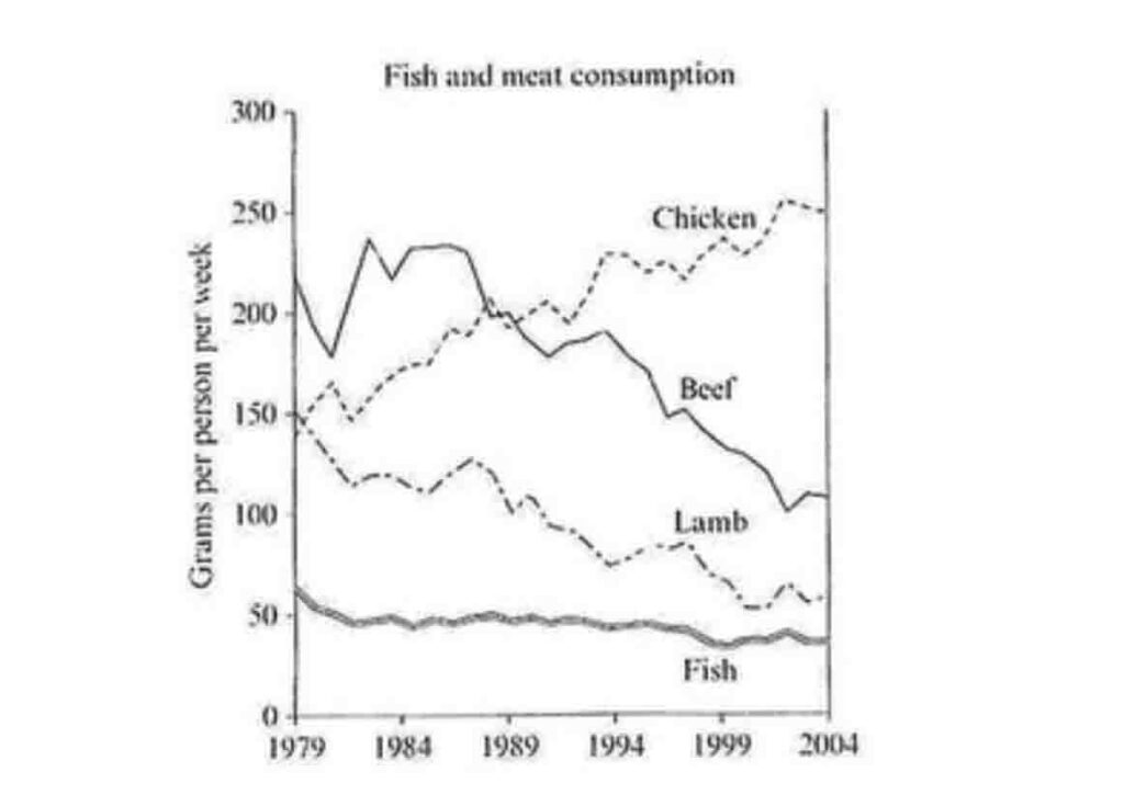
1. Fish and meat consumption:
The line graph below shows the consumption of 4 kinds of meat in a European country from 1979 to 2004.
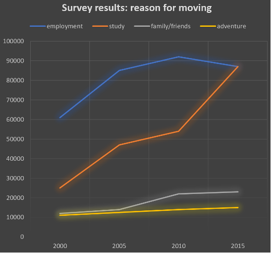
2. Line Graph – Migration:
The line chart below shows the results of a survey giving the reasons why people moved to the capital city of a particular country. Summarise the information by selecting and reporting the main features, and make comparisons where relevant.
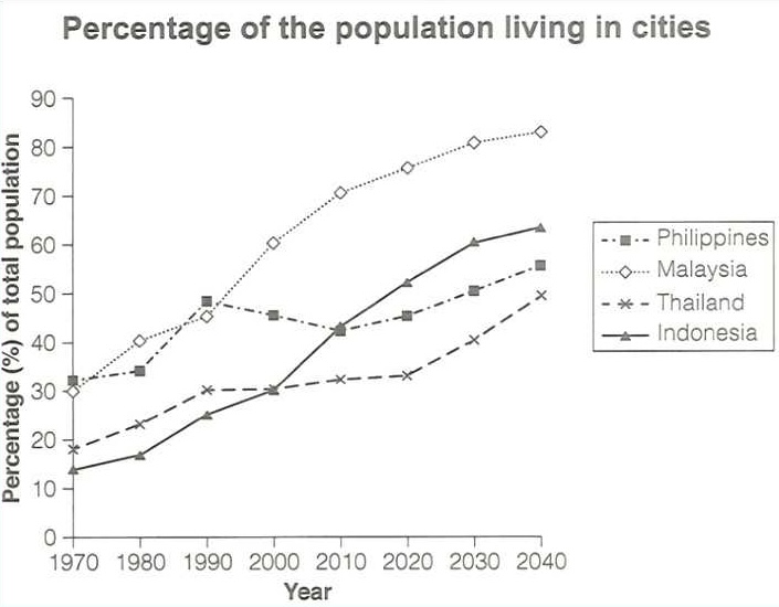
3. IELTS line graph: Population in cities
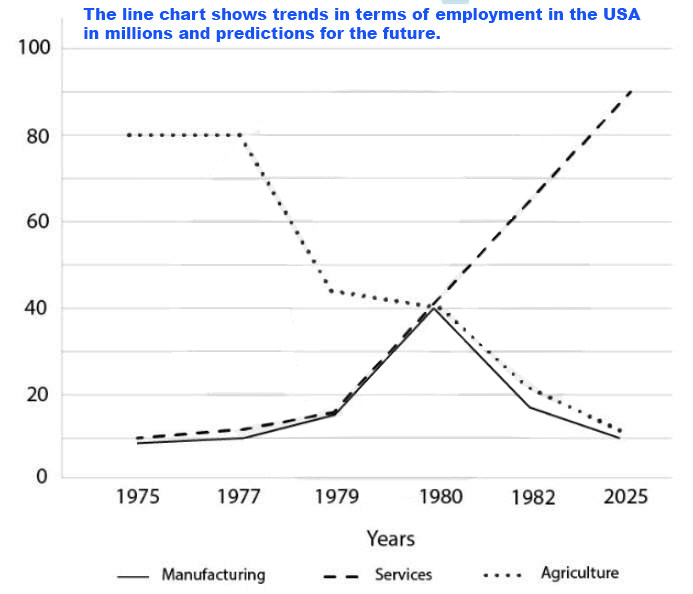
4. Line graph: Employment in the USA
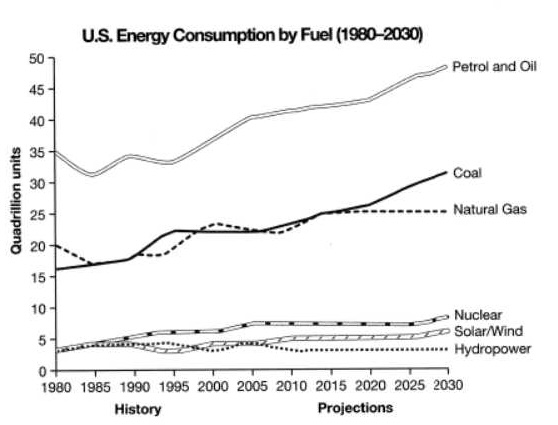
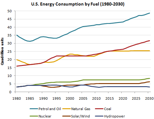
4. IELTS writing task: U.S. Energy Consumption by Fuel
The graph below gives information from a 2008 report about consumption of energy in the USA since 1980 with projections until 2030. Summarise the information by selecting and reporting the main features, and make comparisons where relevant.
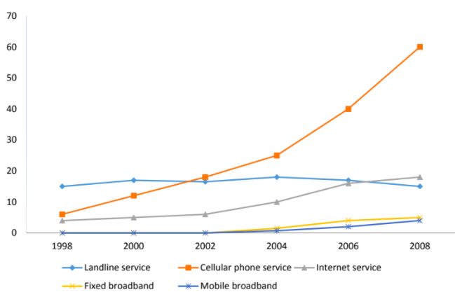
5. IELTS writing task 1: Communication methods
The line graph shows the percentage of people who used five different communication methods between 1998 and 2008.
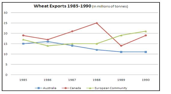
6. IELTS writing task 1: Wheat exports:
7. IELTS writing task 1: Midyear population
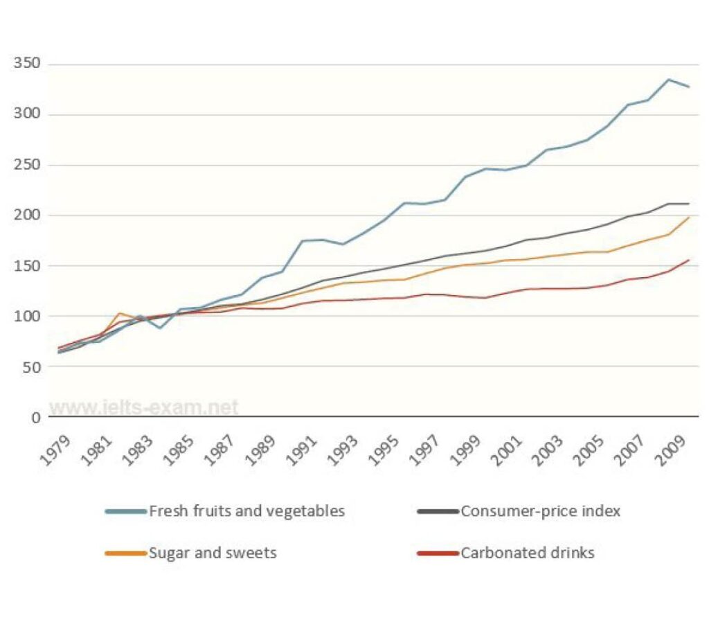
8. IETLS writing task 1: Price changes
The graph below shows relative price changes for fresh fruits and vegetables, sugars and sweets, and carbonated drinks between 1978 and 2009. Summarise the information by selecting and reporting the main features, and make comparisons where relevant.
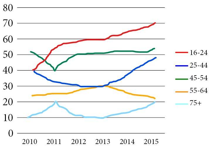
9. IETLS writing task 1: Music concert
The graph below shows the percentage of people in different age groups in one city who attended music concerts between 2010 and 2015.
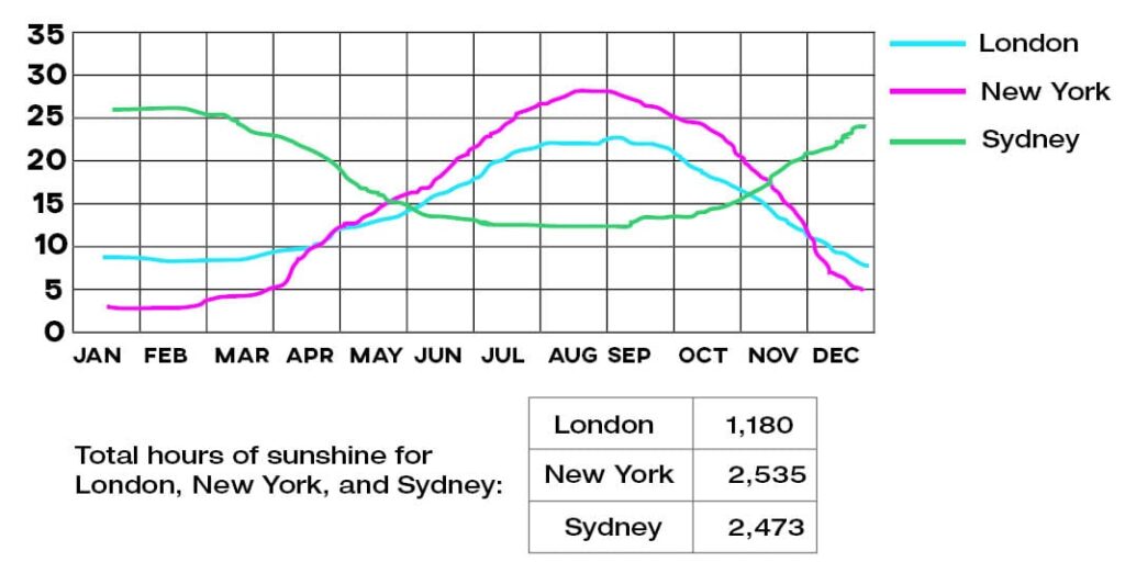
10. IETLS writing task 1: Temperature & Sunshine
The charts below give information about the typical temperatures in London, New York, and Sydney as well as total hours of sunshine for each city.
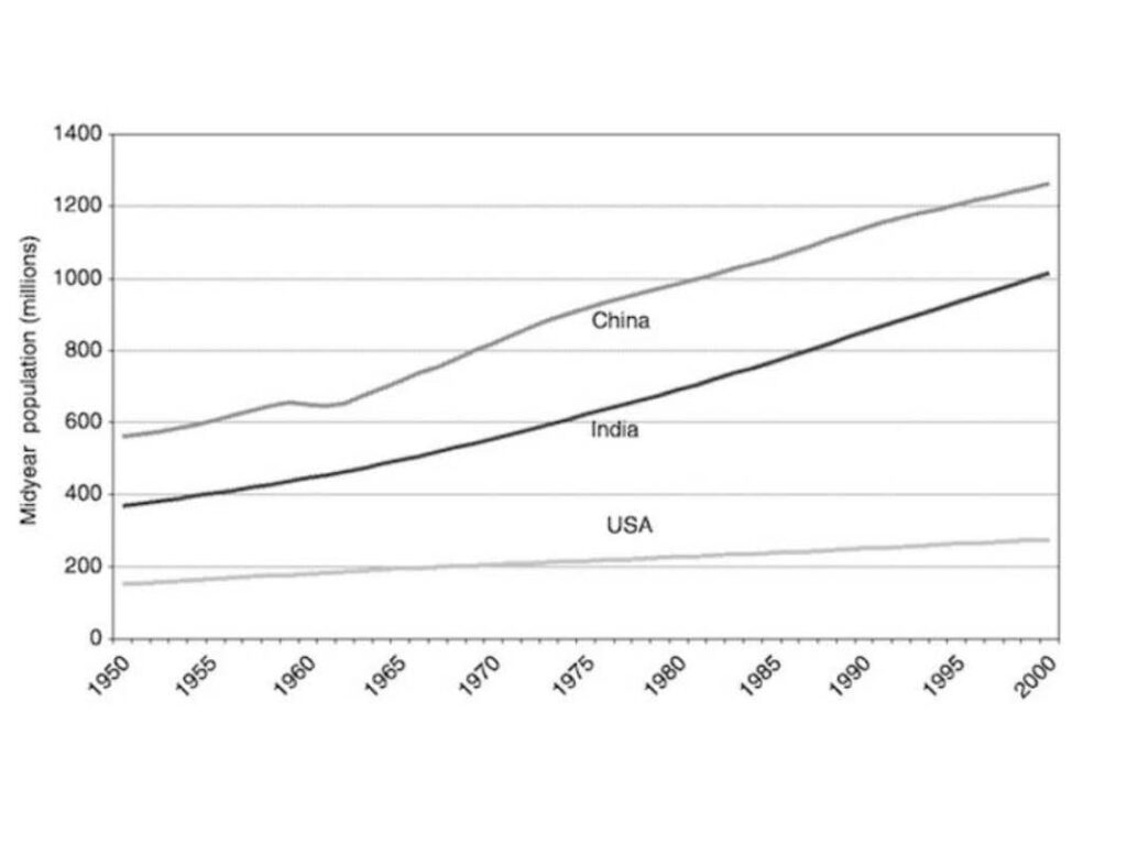
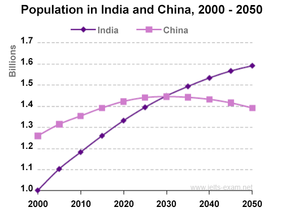
11. IETLS writing task 1: Population in India and China
The graph below shows population figures for India and China since the year 2000 and predicted population growth up until 2050. Summarise the information by selecting and reporting the main features, and make comparisons where relevant.
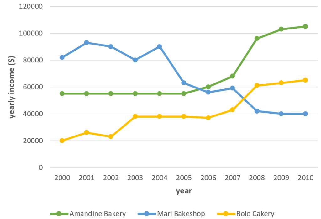
12. IETLS writing task 1: Annual earnings of three bakeries
The graph shows data about the annual earnings of three bakeries in Calgary, 2000-2010. Summarise the information by selecting and reporting the main features, and make comparisons where relevant.
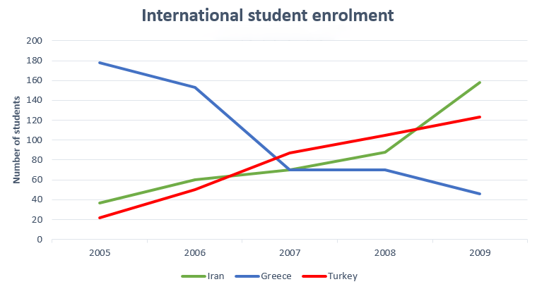
13. IETLS writing task 1: International student enrolment:
The line graph gives information about the number of Iranian, Greek and Turkish students who enrolled at Sheffield University between 2005 and 2009. Summarise the information by selecting and reporting the main features, and make comparisons where relevant.
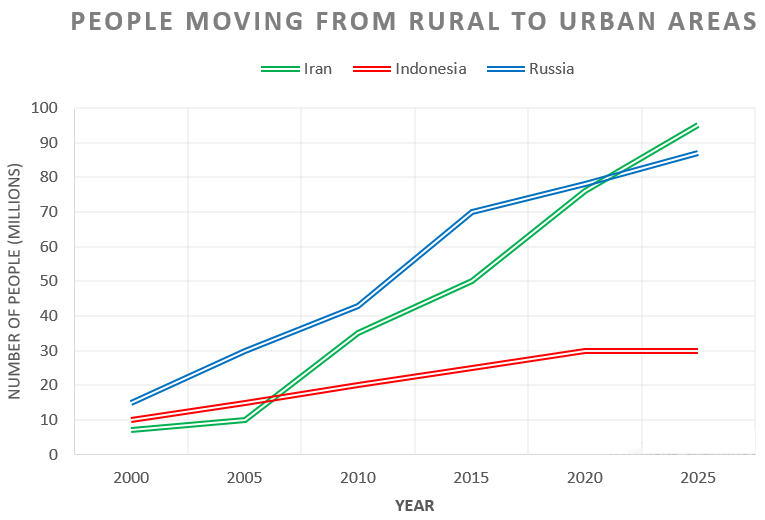
14. IETLS writing task 1: People moving from rural to urban areas
The chart below shows the movement of people from rural to urban areas in three countries and predictions for future years. Summarise the information by selecting and reporting the main features, and make comparisons where relevant.
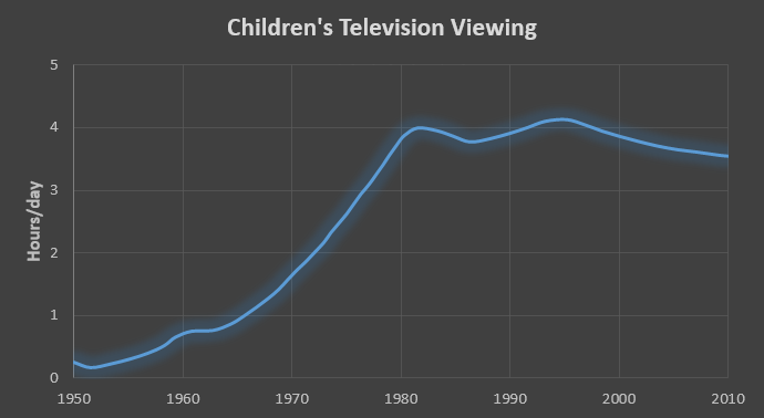
15. IETLS writing task 1: Children’s television viewing
The graph below shows the number of hours per day on average that children spent watching television between 1950 and 2010. Summarise the information by selecting and reporting the main features, and make comparisons where relevant.
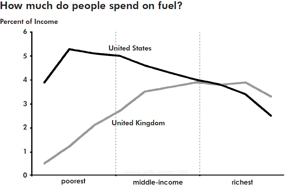
16. IETLS writing task 1: Money spent on fuel
The graph below gives information about how much people in the United States and the United Kingdom spend on fuel. Summarise the information by selecting and reporting the main features, and make comparisons where relevant.
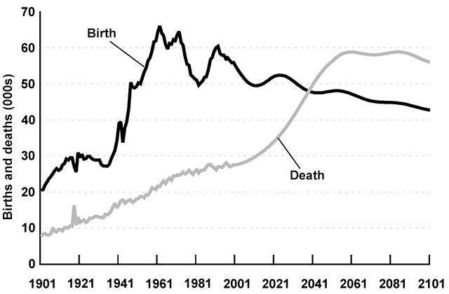
17. IETLS writing task 1: Birth and death rates in New Zealand
The graph below gives information about changes in the birth and death rates in New Zealand between 1901 and 2101. Summarise the information by selecting and reporting the main features, and make comparisons where relevant.
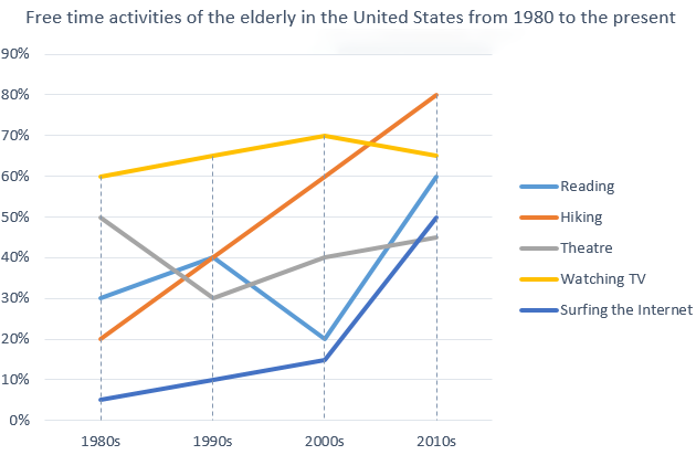
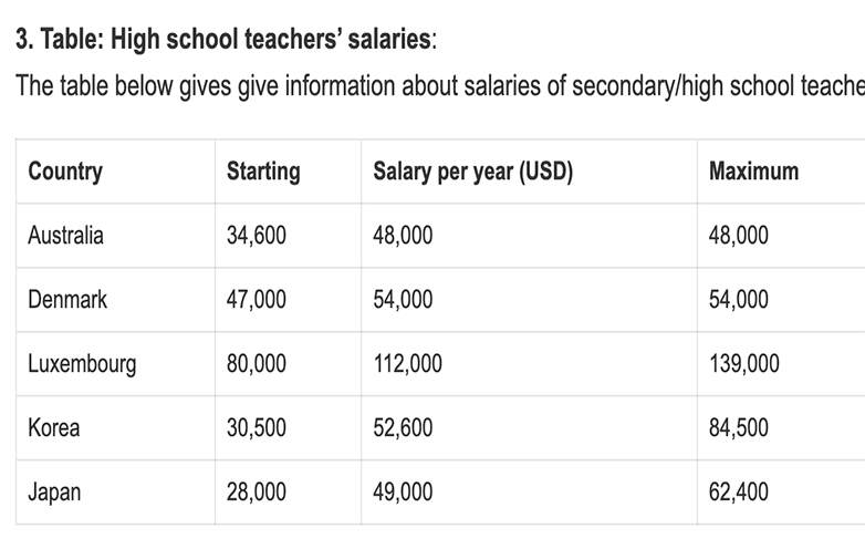
18. IETLS writing task 1: How elderly people in the United States spent their free time?
The graph below shows how elderly people in the United States spent their free time between 1980 and 2010. Summarise the information by selecting and reporting the main features, and make comparisons where relevant.
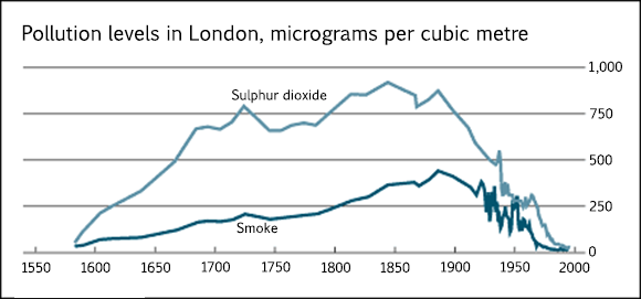
19. IETLS writing task 1: Population in London.
The graph below shows the pollution levels in London between 1600 and 2000. Summarise the information by selecting and reporting the main features, and make comparisons where relevant.
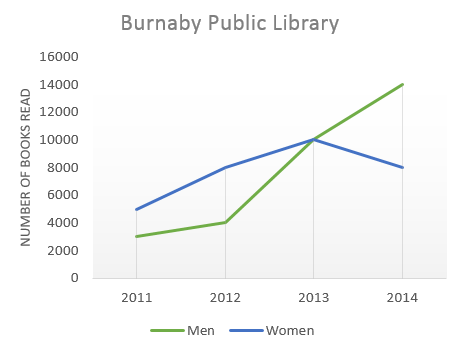
20. IETLS writing task 1: Burnaby Public Library
The graph below shows the number of books read by men and women at Burnaby Public Library from 2011 to 2014. Summarise the information by selecting and reporting the main features, and make comparisons where relevant.
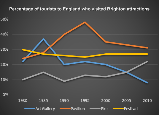
21. IELTS writing task 1. Percentage of tourists to England
The line graph below shows the percentage of tourists to England who visited four different attractions in Brighton. Summarise the information by selecting and reporting the main features, and make comparisons where relevant.
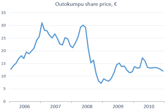
22. IELTS writing task 1. Share price of Outokumpu companies
The line graph below shows the changes in the share price of Outokumpu companies in euros between January 2006 and December 2010. Summarise the information by selecting and reporting the main features, and make comparisons where relevant.
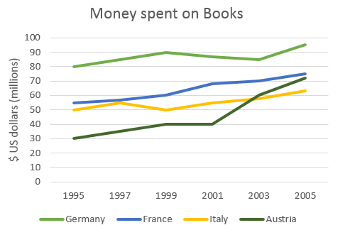
23. IELTS writing task 1. Money spent on books
The graph below shows the amount of money spent on books in Germany, France, Italy and Austria between 1995 and 2005. Summarise the information by selecting and reporting the main features, and make comparisons where relevant.
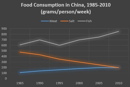
24. IELTS writing task 1. Food consumption by Chinese
The graph below shows the changes in food consumption by Chinese people between 1985 and 2010. Summarise the information by selecting and reporting the main features, and make comparisons where relevant.
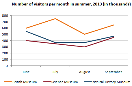
25. IELTS writing task 1. Number of visitors to three London museums
The line graph below gives information about the number of visitors to three London museums between June and September 2013. Summarise the information by selecting and reporting the main features, and make comparisons where relevant.
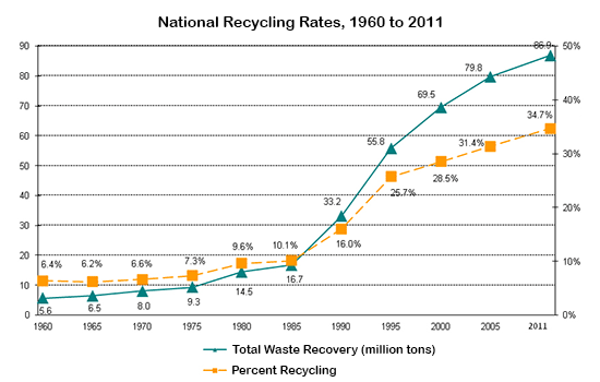
26. IELTS writing task 1. Waste recycling rates in the U.S.
The graph below shows waste recycling rates in the U.S. from 1960 to 2011. Summarise the information by selecting and reporting the main features, and make comparisons where relevant.
27. IELTS writing task 1. Consumption of energy in the USA
The graph below gives information from Annual Energy Outlook 2008 about consumption of energy in the USA since 1980 with projection until 2030. Summarise the information by selecting and reporting the main features, and make comparisons where relevant.
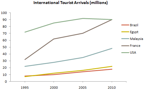
28. IELTS writing task 1. International tourist arrivals
The graph below gives information about international tourist arrivals in five countries. Summarise the information by selecting and reporting the main features, and make comparisons where relevant.
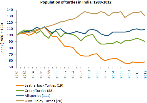
29. IELTS writing task 1. Population of turtles in India
The graph below shows the population figures of different types of turtles in India between 1980 and 2012. Summarise the information by selecting and reporting the main features, and make comparisons where relevant.
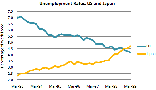
30. IELTS writing task 1. Unemployment rates in the US and Japan
The graph below shows the unemployment rates in the US and Japan between March 1993 and March 1999. Summarise the information by selecting and reporting the main features, and make comparisons where relevant.
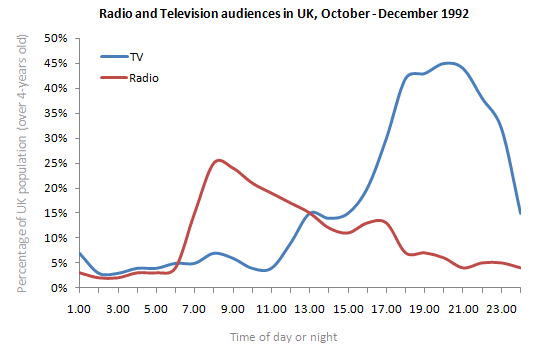
31. IELTS writing task 1. Radio and television audiences
The graph below shows radio and television audiences throughout the day in 1992. Write a report for a university lecturer describing the information shown below.
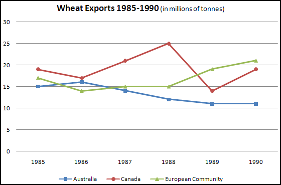
32. IELTS writing task 1. Wheat exports
The graph below shows the differences in wheat exports over three different areas. Write a report for a university lecturer describing the information shown below.
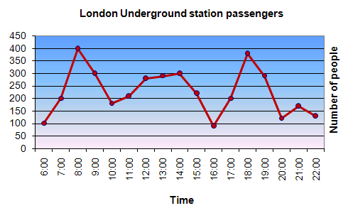
33. IELTS writing task 1. Underground Station Passenger Numbers in London.
The graph shows Underground Station Passenger Numbers in London. Summarise the information by selecting and reporting the main features, and make comparisons where relevant.
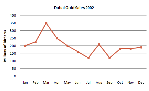
34. IELTS writing task 1. Dubai Gold Sales
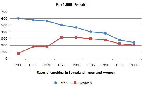
35. IELTS writing task 1. Rates of smoking
IELTS Academic Writing Task 1 Types
Explore and prepare for different chart types used in IELTS Task 1
IELTS Bar Charts
Understand how to interpret and describe bar charts in task 1.

IELTS Pie Charts
Learn the techniques for describing pie charts in detail.
IELTS Line Graph
Get tips on how to describe trends using line graphs.
IELTS Table
Master the skills to describe tables in academic writing.
IELTS Bar Chart + Table
Learn how to combine bar charts with tables in task 1 responses.
IELTS Maps
Explore how to describe maps and geographical changes.
IELTS Process Diagram
Understand how to write about process diagrams step by step.
IELTS Bar Chart + Line Graph
Learn how to integrate bar charts with line graphs.

IELTS Bar Chart + Pie Chart
Master combining bar charts with pie charts in task 1.
Do you need printed IELTS/ OET practice material? Place your order today. Available now for just Rs: 1,100 (including shipping all across India) Contact us at our WhatsApp number: +91 9886926773 to place your order. (Free for LTC students)

We hope this information has been valuable to you. If so, please consider a monetary donation to Lifestyle Training Centre via UPI. Your support is greatly appreciated.

Would you like to undergo training for OET, PTE, IELTS, Duolingo, Phonetics, or Spoken English with us? Kindly contact us now!
📱 Call/WhatsApp/Text: +91 9886926773
📧 Email: mail@goltc.in
Visit us in person by following the directions on Google Maps. We look forward to welcoming you to the Lifestyle Training Centre.
Follow Lifestyle Training Centre on social media:
Thank you very much!