Model answer by Lifestyle Training Centre
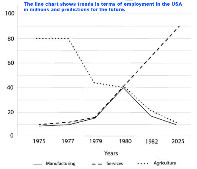
The given line diagram projects job opportunities in three different sectors, namely, manufacturing, services, and agriculture, in the United States of America, spanning from 1975 to year 2025. The numbers are portrayed in millions.
Evidently, employment in the services sector demonstrates a marked upward trajectory throughout the given period. In comparison, both the agricultural sector and the manufacturing sector experience a decline in jobs, despite a notable surge in manufacturing sector in the initial half.
Zooming in, the services sector, which had 10 million jobs in 1975, witnesses only a marginal ascent to around 15 million by 1979. However, then on, it skyrockets to nearly 90 million by 2025, marking an astounding upsurge.
The agriculture sector, despite initially holding the top position in employment with 80 million jobs from 1975 to 1977, undergoes a dramatic plunge and decreases to nearly 10 million by 2025. Interestingly, the manufacturing sector, though it had risen from around 10 million in 1975 to a substantial 40 million jobs in 1980, ultimately tumbles close to the initial numbers by 2025.
(word count: 178)
IELTS Graph 📊
Line graph for academic ielts ; all the graph of this site really help me in writings . The vocabulary and sentences making all are fantastic.
Thank you, Sharu. 🙂