In IELTS Writing Task 1, a bar chart is a graphical representation of data using rectangular bars or columns. Each bar corresponds to a specific category, and the length of the bar represents the quantity or value associated with that category. The primary purpose of describing a bar chart is to analyze and report the key features, trends, and comparisons within the data. It could involve various types of bar charts, including single or multiple bars, grouped bars, or stacked bars, each presenting different aspects of information. When responding to a bar chart in IELTS Task 1, candidates are expected to provide a clear overview and detailed analysis of the data, using appropriate vocabulary and structure to convey the information accurately.
Here is a list of IELTS Bar Chart questions ans sample answers:
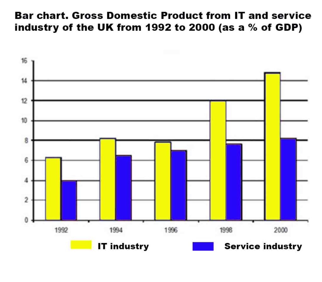
1. IELTS Writing task 1. GDP
Bart chart, Gross Domestic Product from IT and service industry of the UK from 1992 to 2000 (as a % of GDP)
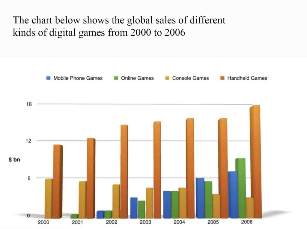
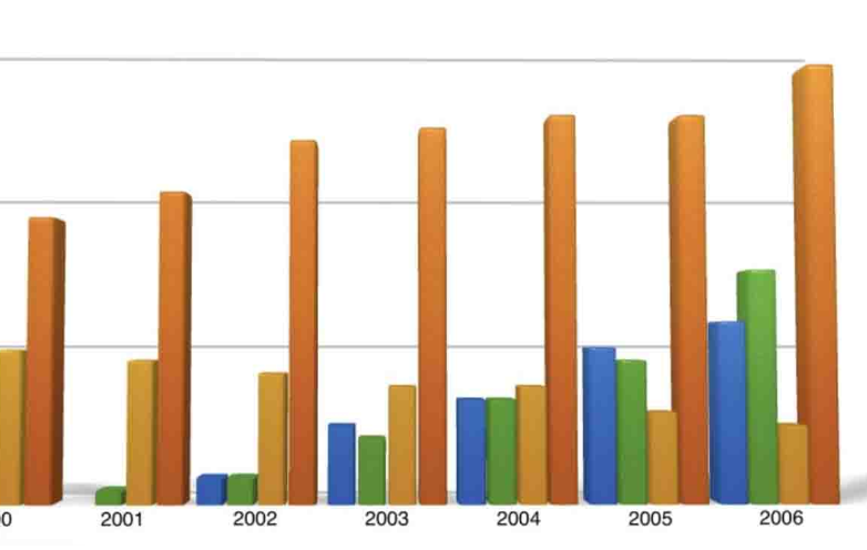
2. IELTS Writing task 1. Global sales of games
The chart below shows the global sales of different kinds of digital games from 2000 to 2006.
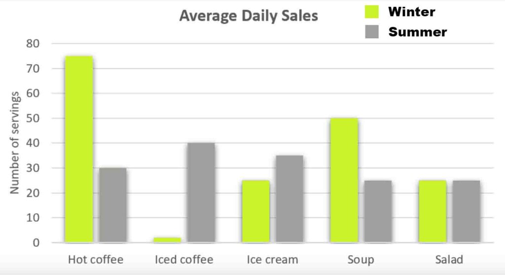
3. IELTS Writing task 1. Starbucks’ sales
The graph below shows the average daily sales of selected food items at Starbucks, by season. Summarise the information by selecting and reporting the main features, and make comparisons where relevant. Write at least 150 words.
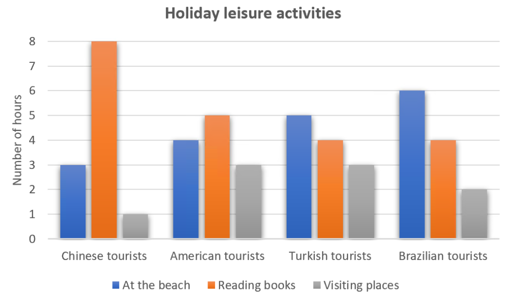
4. IELTS Writing task 1. Holiday leisure activities.
The chart shows the average number of hours each day that Chinese, American, Turkish and Brazilian tourists spent doing leisure activities while on holiday in Greece in August 2019.
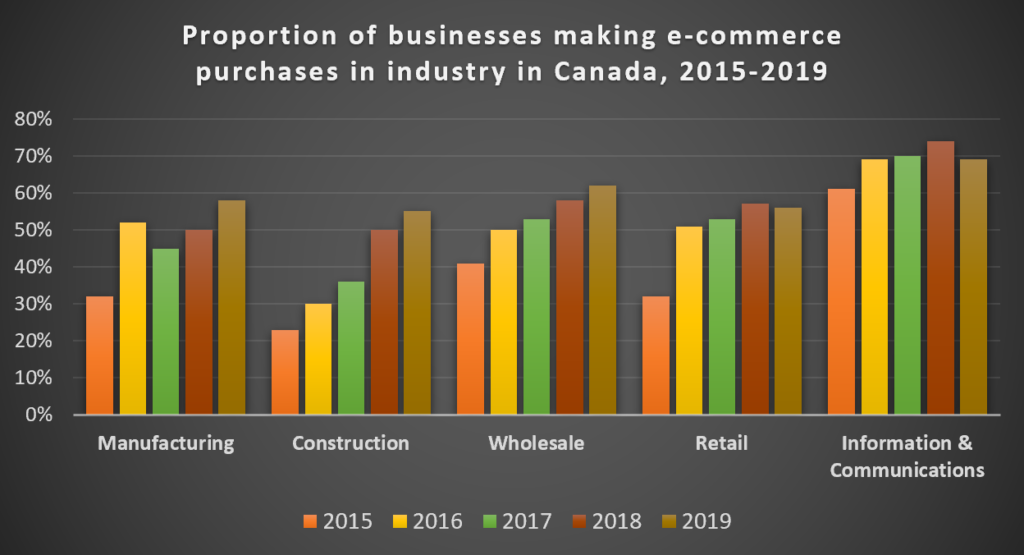
5. IELTS Writing task 1. Proportion of businesses making e-commerce purchases
The chart below shows the proportion of businesses making e-commerce purchases by industry in Canada between 2015 and 2019. Summarise the information by selecting and reporting the main features, and make comparisons where relevant.
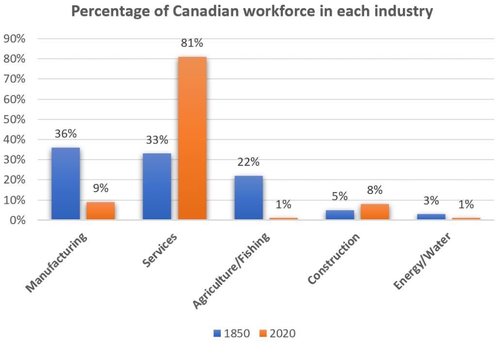
6. IELTS Writing task 1. Percentages of the Canadian workforce
The bar chart shows the percentages of the Canadian workforce in five major industries in 1850 and 2020. Summarise the information by selecting and reporting the main features, and make comparisons where relevant.
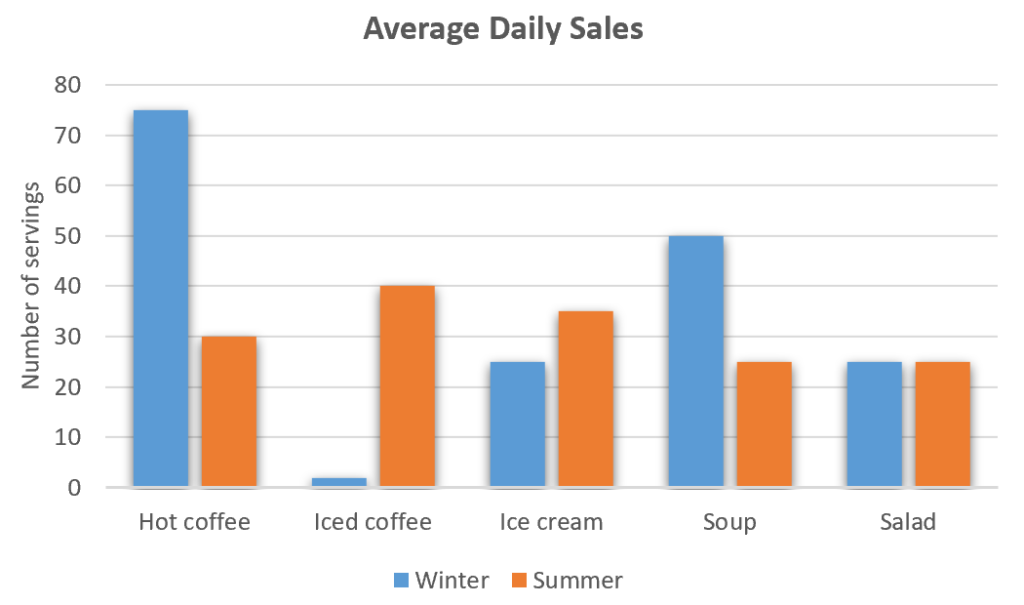
7. IELTS Writing task 1. Average daily sales at the Brisk Café
The graph below shows the average daily sales of selected food items at the Brisk Café, by season. Summarise the information by selecting and reporting the main features, and make comparisons where relevant.
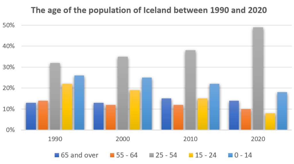
8. IELTS Writing task 1. The age of the population of Iceland
The graph gives information about the age of the population of Iceland between 1990 and 2020. Summarise the information by selecting and reporting the main features, and make comparisons where relevant.
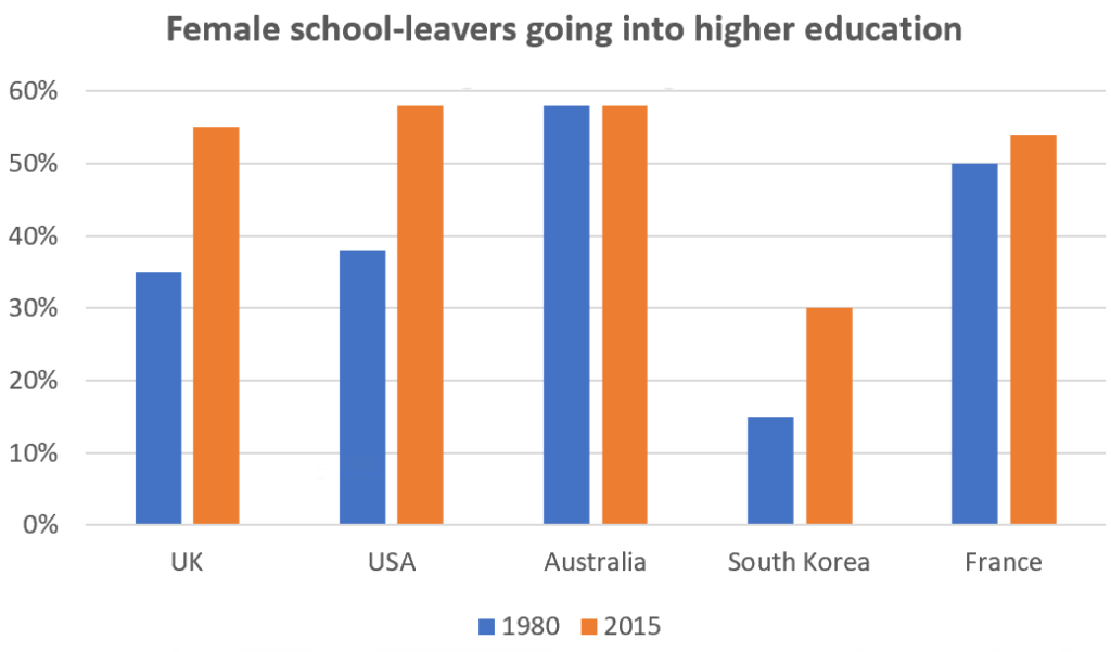
9. IELTS Writing task 1. Percentage of women going into higher education.
The chart gives information on the percentage of women going into higher education in five countries for the years 1980 and 2015. Summarise the information by selecting and reporting the main features, and make comparisons where relevant.
10. IELTS Writing task 1. Road transport in a number of European countries.
The bar charts below give information on road transport in a number of European countries. Summarise the information by selecting and reporting the main features, and make comparisons where relevant.
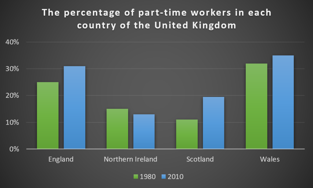
11. IELTS Writing task 1. Part-time workers in the UK
The graph below shows the percentage of part-time workers in each country of the United Kingdom in 1980 and 2010. Summarise the information by selecting and reporting the main features, and make comparisons where relevant.
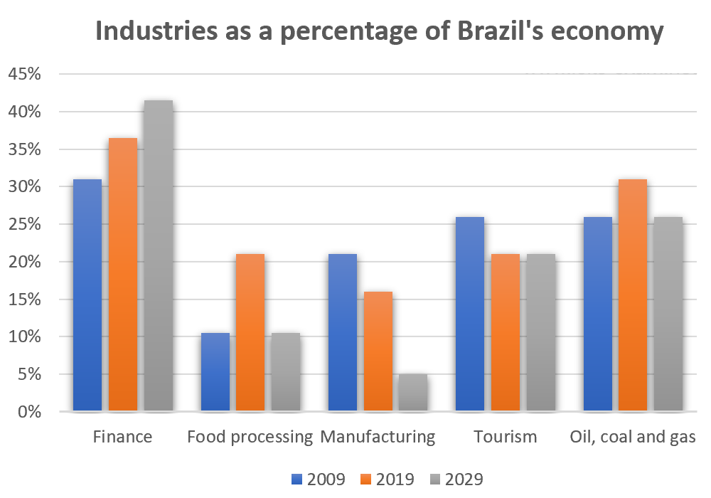
12. IELTS Writing task 1. Industries’ percentage share of Brazil’s economy
The bar chart below illustrates five different industries’ percentage share of Brazil’s economy in 2009 and 2019 with a forecast for 2029. Summarise the information by selecting and reporting the main features, and make comparisons where relevant.
13. IELTS Writing task 1. Employment in three countries
The bar charts below show the percentages of men and women in employment in three countries in 2005 and 2015. Summarise the information by selecting and reporting the main features, and make comparisons where relevant
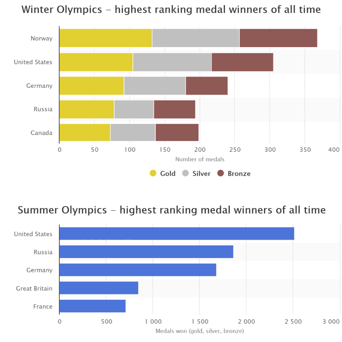
14. IELTS Writing task 1. Number of medals won by the top five countries
The graphs below show the number of medals won by the top five countries in the summer and winter Olympics. Summarise the information by selecting and reporting the main features, and make comparisons where relevant.
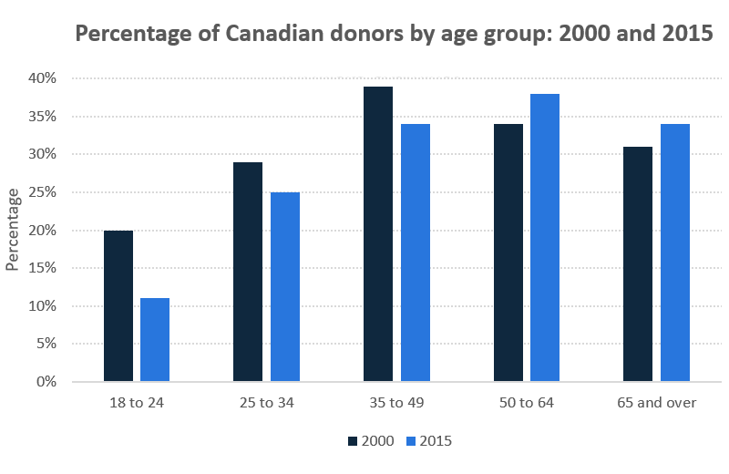
15. IELTS Writing task 1.Percentage of Canadians gave money to charitable organisations
The chart below gives information on the percentage of Canadians gave money to charitable organisations by age range for the years 2000 and 2015. Summarise the information by selecting and reporting the main features, and make comparisons where relevant
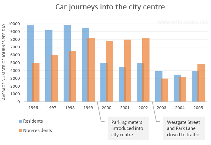
16. IELTS Writing task 1. Car journeys into the city centre
The bar chart gives information about the number of car journeys into the city centre made by residents and non-residents. Summarise the information by selecting and reporting the main features, and make comparisons where relevant.
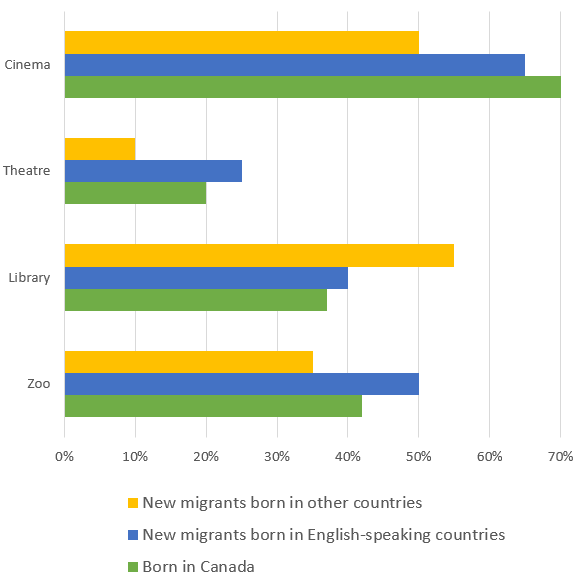
17. IELTS Writing task 1. Places visited by different people living in Canada.
The chart below shows the places visited by different people living in Canada. Summarise the information by selecting and reporting the main features, and make comparisons where relevant
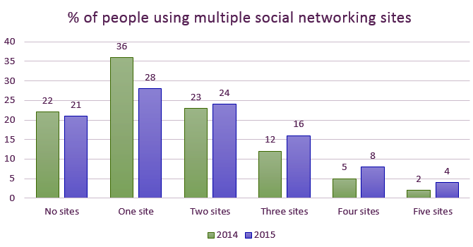
18. IELTS Writing task 1. Number of social networking sites people used
The chart below gives information about the number of social networking sites people used in Canada in 2014 and 2015. Summarise the information by selecting and reporting the main features, and make comparisons where relevant.
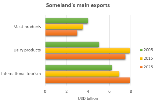
19. IELTS Writing task 1. Someland’s main exports
The chart below gives information about Someland’s main exports in 2005, 2015, and future projections for 2025. Summarise the information by selecting and reporting the main features, and make comparisons where relevant.
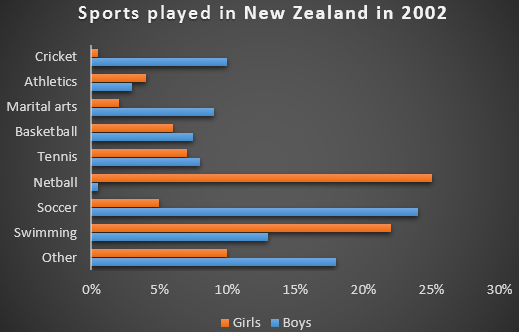
20. IELTS Writing task 1. Most common sports played in New Zealand
The chart below gives information about the most common sports played in New Zealand in 2002. Summarise the information by selecting and reporting the main features, and make comparisons where relevant.
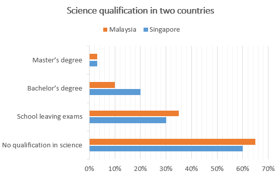
21. IELTS Writing task 1. Science qualifications held by people in two countries.
The chart below gives information about science qualifications held by people in two countries. Summarise the information by selecting and reporting the main features, and make comparisons where relevant.
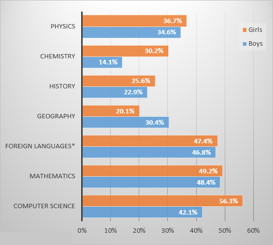
22. IELTS Writing task 1. Students who passed their high school competency exams,
The bar chart below shows the percentage of students who passed their high school competency exams, by subject and gender, during the period 2010-2011. Summarise the information by selecting and reporting the main features, and make comparisons where relevant.
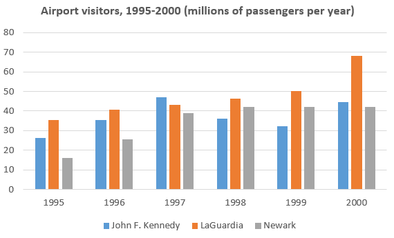
23. IELTS Writing task 1. Number of travellers using three major airports in New York City
The chart below shows the number of travellers using three major airports in New York City between 1995 and 2000. Summarise the information by selecting and reporting the main features, and make comparisons where relevant.
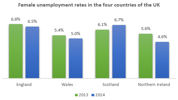
24. IELTS Writing task 1. Female unemployment rates in each country of the United Kingdom
The graph below shows female unemployment rates in each country of the United Kingdom in 2013 and 2014. Summarise the information by selecting and reporting the main features, and make comparisons where relevant.
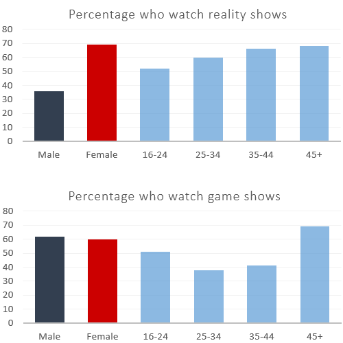
25. IELTS Writing task 1. Two genres of TV programmes watched by men and women
The charts give information about two genres of TV programmes watched by men and women and four different age groups in Australia. Summarise the information by selecting and reporting the main features, and make comparisons where relevant.
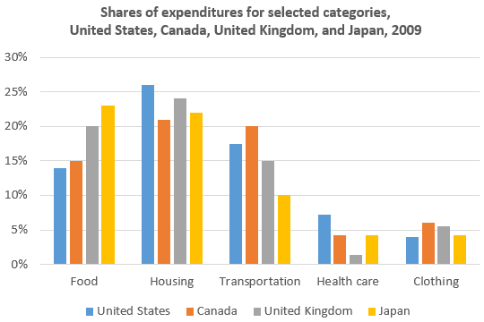
26. IELTS Writing task 1. Shares of expenditures for five major categories
The bar chart below shows shares of expenditures for five major categories in the United States, Canada, the United Kingdom, and Japan in the year 2009. Summarise the information by selecting and reporting the main features, and make comparisons where relevant.
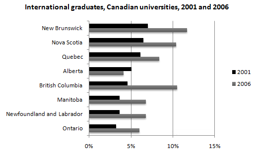
27. IELTS Writing task 1. Percentage change in the share of international students
The chart below shows the percentage change in the share of international students among university graduates in different Canadian provinces between 2001 and 2006. Summarise the information by selecting and reporting the main features, and make comparisons where relevant.
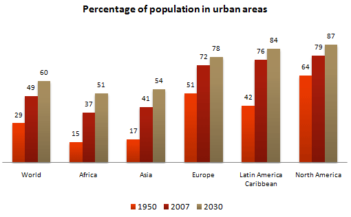
28. IELTS Writing task 1. Percentage of the population living in urban areas
The bar chart below gives information about the percentage of the population living in urban areas in the world and in different continents. Summarise the information by selecting and reporting the main features, and make comparisons where relevant.
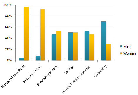
29. IELTS Writing task 1. Percentage of male and female teachers
The chart below shows the percentage of male and female teachers in six different types of educational setting in the UK in 2010. Summarise the information by selecting and reporting the main features, and make comparisons where relevant.
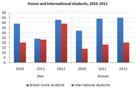
30. IELTS Writing task 1. Students studying Computer Science
The bar chart below gives information about the number of students studying Computer Science at a UK university between 2010 and 2012. Summarise the information by selecting and reporting the main features, and make comparisons where relevant.
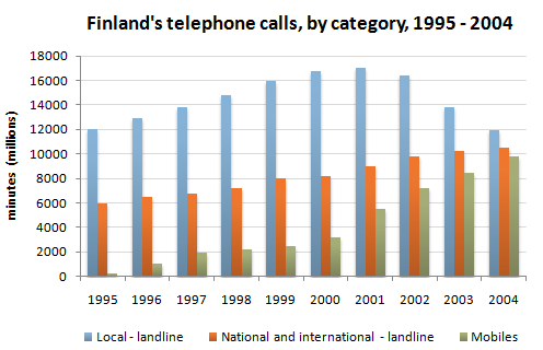
31. IELTS Writing task 1. Telephone calls in Finland
The chart below shows the total number of minutes (in millions) of telephone calls in Finland, divided into three categories, from 1995 – 2004. Summarise the information by selecting and reporting the main features, and make comparisons where relevant.
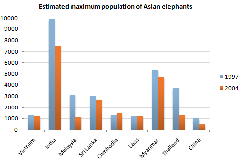
32. IELTS Writing task 1. Changes in maximum number of Asian elephants
The graph below shows the changes in maximum number of Asian elephants between 1994 and 2007. Summarise the information by selecting and reporting the main features, and make comparisons where relevant.
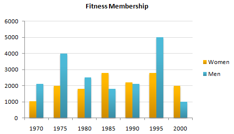
33. IELTS Writing task 1. Male and female fitness membership
The chart below shows male and female fitness membership between 1970 and 2000. Summarise the information by selecting and reporting the main features, and make comparisons where relevant.
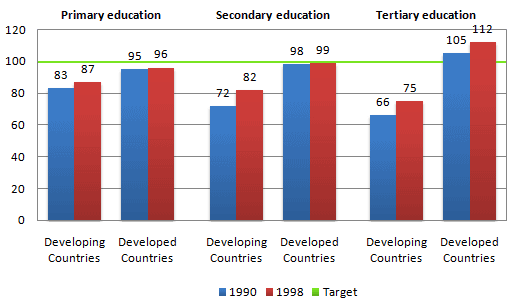
34. IELTS Writing task 1. The number of girls per 100 boys
The chart below shows the number of girls per 100 boys enrolled in different levels of school education. Summarise the information by selecting and reporting the main features, and make comparisons where relevant.
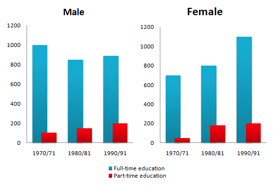
35. IELTS Writing task 1. Education in Britain
The chart below shows the number of men and women in further education in Britain in three periods and whether they were studying fulltime or part-time. Summarise the information by selecting and reporting the main features, and make comparisons where relevant.
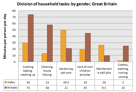
36. IELTS Writing task 1. Division of household tasks by gender in Great Britain.
The chart shows the division of household tasks by gender in Great Britain. Summarise the information by selecting and reporting the main features, and make comparisons where relevant.
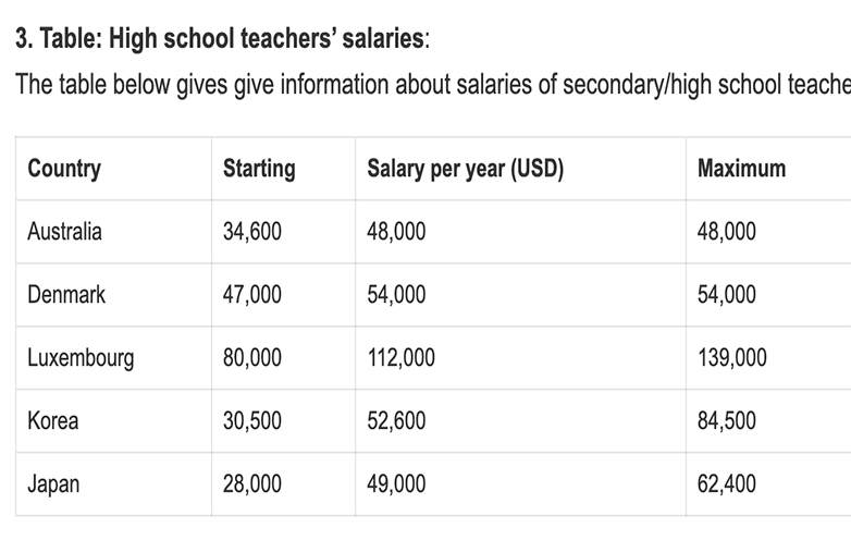
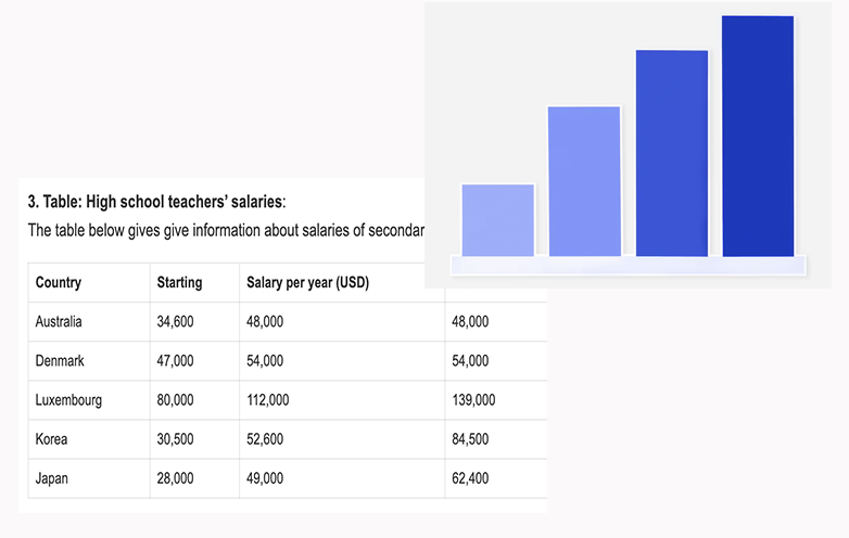
37. IELTS Writing task 1. Student’s expenditure in the United Kingdom.
The chart shows student expenditure over a three-year period in the United Kingdom. Summarise the information by selecting and reporting the main features, and make comparisons where relevant.
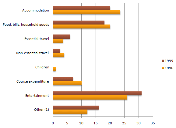
Percentage of total expenditure
(1) includes non-essential consumer items and credit repayments
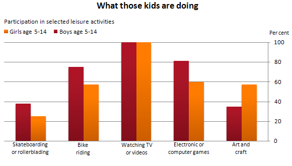
38. IELTS Writing task 1. Preferred leisure activities of Australian children.
The graph below gives information about the preferred leisure activities of Australian children. Write a report for a university lecturer describing the information shown.
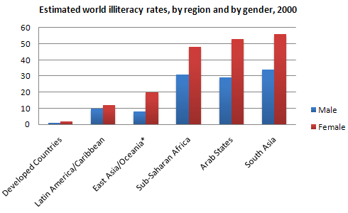
39. IELTS Writing task 1. Estimated world literacy rates by region and by gender
The chart below shows estimated world literacy rates by region and by gender for the year 2000. Write a report for a university lecturer describing the information below.
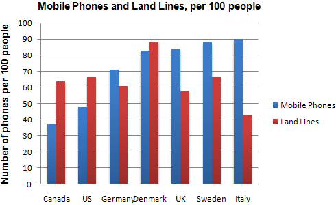
40. IELTS Writing task 1. Mobile phones and landlines per 100 people
The chart shows the number of mobile phones and landlines per 100 people in selected countries. Write a report for a university lecturer describing the information given.
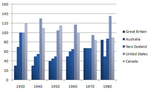
41. IELTS Writing task 1. Figures for imprisonment in five countries
The chart below shows the figures for imprisonment in five countries between 1930 and 1980. Write a report for a university, lecturer describing the information shown below.
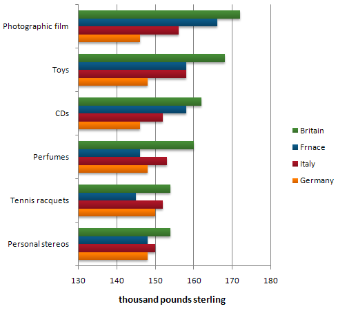
42. IELTS Writing task 1. Amount spent on six consumer goods
The chart below shows the amount spent on six consumer goods in four European countries. Write a report for a university lecturer describing the information shown below.
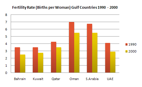
43. IELTS Writing task 1. Fertility rate
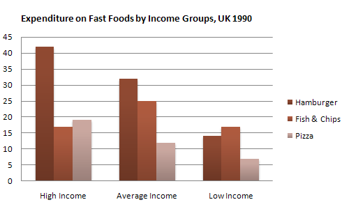
44. IELTS Writing task 1. Expenditure on fast foods
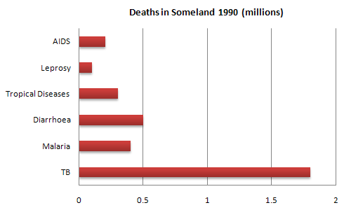
45. IELTS Writing task 1. Death and research funding
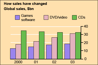
46. IELTS Writing task 1. Global sales of games software, CDs and DVD or video.
The chart below gives information about global sales of games software, CDs and DVD or video. Summarise the information by selecting and reporting the main features, and make comparisons where relevant.
IELTS Academic Writing Task 1 Types
Explore and prepare for different chart types used in IELTS Task 1
IELTS Bar Charts
Understand how to interpret and describe bar charts in task 1.

IELTS Pie Charts
Learn the techniques for describing pie charts in detail.
IELTS Line Graph
Get tips on how to describe trends using line graphs.
IELTS Table
Master the skills to describe tables in academic writing.
IELTS Bar Chart + Table
Learn how to combine bar charts with tables in task 1 responses.
IELTS Maps
Explore how to describe maps and geographical changes.
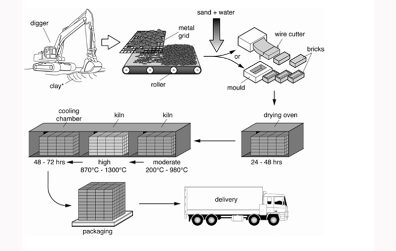
IELTS Process Diagram
Understand how to write about process diagrams step by step.
IELTS Bar Chart + Line Graph
Learn how to integrate bar charts with line graphs.

IELTS Bar Chart + Pie Chart
Master combining bar charts with pie charts in task 1.
Do you need printed IELTS/ OET practice material? Place your order today. Available now for just Rs: 1,100 (including shipping all across India) Contact us at our WhatsApp number: +91 9886926773 to place your order. (Free for LTC students)
We hope this information has been valuable to you. If so, please consider a monetary donation to Lifestyle Training Centre via UPI. Your support is greatly appreciated.

Would you like to undergo training for OET, PTE, IELTS, Duolingo, Phonetics, or Spoken English with us? Kindly contact us now!
📱 Call/WhatsApp/Text: +91 9886926773
📧 Email: mail@goltc.in
Visit us in person by following the directions on Google Maps. We look forward to welcoming you to the Lifestyle Training Centre.
Follow Lifestyle Training Centre on social media:
Thank you very much!