The pie charts below compare the proportion of energy capacity in gigawatts (GW) in 2015 with the predictions for 2040.Summarise the information by selecting and reporting the main features, and make comparisons where relevant.
Model answer by Lifestyle Training Centre
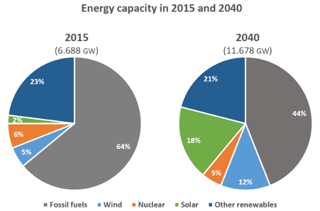
The provided two pie charts compare the percentage of energy produced in 2015 with the projected figures for 2040, across various sources including fossil fuels, wind, nuclear, solar, and other renewables. The energy capacity is delineated in gigawatts (GW).
Overall, it is evident that fossil fuels and other renewables remain the major energy contributors throughout the given period. Moreover, solar and wind energy are predicted to increase substantially in the future.
The aggregate capacity in 2015 was 6.688 GW, which is expected to almost double to 11.678 GW by 2040. Fossil fuels covered 64% of the energy capacity, which will undergo a considerable downturn to a mere 44% by the year 2040. Other renewables and nuclear, however, are expected to only experience a marginal decline in energy production: the former from 23% in 2015 to 21% by 2040, and the latter from 6% in 2015 to 5% in 2040.
Conversely, both solar and wind energy are estimated to soar remarkably – solar from 2% in 2015 to a staggering 18% by 2040, and wind energy from 5% in 2015 to 12% by 2040.
IELTS AC WRITING TASK 1